In today’s fast-paced digital landscape, a mobile app’s home screen serves as its front door—the very first impression users encounter. It’s where the magic begins, where your app’s essence is captured, and where user journeys commence. Designing an engaging, user-friendly, and aesthetically pleasing home screen is paramount to ensuring your app’s success.
Welcome to our guide on “How to Design the Home Screen of Your App on Swing2App.” Swing2App no-code app builder is your ticket to crafting remarkable apps, and the home screen is your canvas to make that all-important first impression. This guide is your roadmap to creating a captivating home screen, suitable for both novice and experienced developers. From template selection to customization, functionality integration, and branding infusion, we’ll cover it all. We’ll provide practical tips to ensure your home screen engages users, enhances their experience, and leaves a lasting impression.
Let’s embark on a journey to unveil the secrets of crafting a remarkable app home screen with Swing2App.
WHAT IS HOME SCREEN ?
Think of a home screen in an app like the main hub of a building. It’s where you start your journey and where you see important information. For example, in a smart home app, it shows things like the various controls (TV, Lights) and security status.
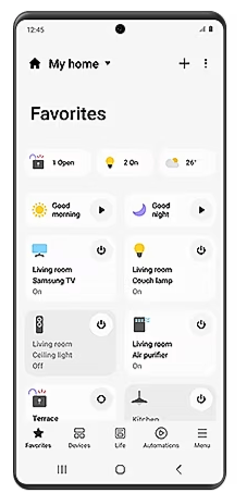
Home screens are super important because they connect everything in the app. They need to be easy to use, even if they have lots of info. They also help you move around the app. You can usually find everything you need from the home screen, often with a search bar.
Home screens are like a map for your app. They’re crucial if your app has lots of stuff, so you don’t get lost. For example, the Headspace meditation app gives you daily meditation tasks based on your goals. It makes things easy to find and even lets you pick your favorites.
So, home screens are like the guiding star of your app. They should make sure you never get lost and help you find what you want quickly.
CREATING THE APP BEFORE TO DESIGN THE HOME SCREEN
First, it’s important to design the app on Swing2App no-code app maker only then you can create a home screen page or other pages within it.
The app’s home screen lets users get the most important pages within your app quickly. Swing2App home screen consists of one slideshow and one or more button rows for e-commerce apps, others can also use Swing2App pre-built templates to design their home screen. When creating the home screen, it’s important to bear in mind this framework to make sure that the structure aligns with the functionality of the actual buttons.
Slideshow is a great choice for sale promotions. You are allowed to create a slideshow of as many slides/images as you wish and disable the slideshow if you no longer want it.
To create an app with Swing2App no-code app builder is as simple as walking in the park, with the user-friendly interface and prebuilt templates you can build an app in no time!
Let’s take a look at how to build an app with Swing2App no-code app.
To build a no-code app with Swing2App no-code app builder all you need a brilliant app idea and a creative mind! Without even a single line of code you can create professional looking and aesthetically pleasing apps in no time by yourself!
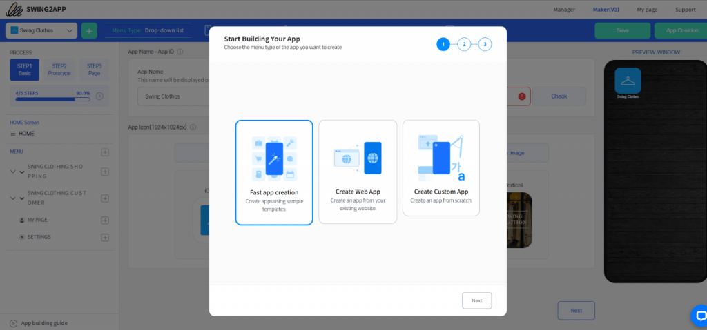
To start click on the “+” icon to create a new app, and then choose one of the three options;
1. Fast app creation: to build apps quickly using the pre-built template with added features, menus and pages; all you need to do is add your own products/ services and your app will be ready.
2. Create web apps: to convert your existing website into an app without any coding at all.
3. Create custom app: to create a no-code app from scratch by selecting g a prototype, template, color theme, and adding menus and app pages individually. This takes more time as compared to the fast app creation process however, you get more freedom to customize your app.
Let’s choose fast app creation to understand the further process.
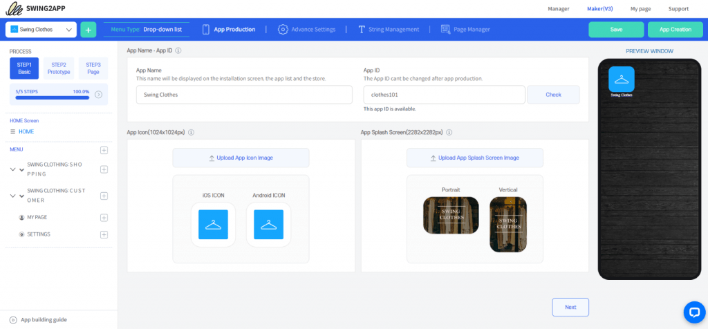
STEP 1: APP BASICS
Then you will be direct to the new Maker V3 screen where you can see further options, settings, and features. Here you also get a “Preview Window” where all your changes are displayed in real-time which means you can see how your customization affects your app while editing it.
Your app icon should be unique and attractive enough to catch the eye of potential customers among the variety of apps available on the app stores.
To complete Step 1 finally, you need to enter a unique “App ID” alphanumeric character, with this the Step 1 BACIS is completed.
STEP2: PROTOYPE & COLOR THEME SELECTION
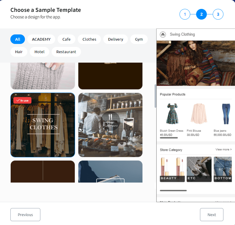
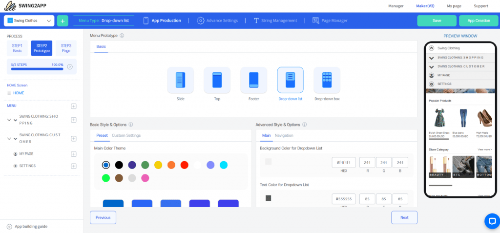
A prototype (Mobile UI) is the basic outline or design (like a wireframe) of your app, where the menu outlay and home screen are pre-set in a particular way that they will be displayed to the user.
The 5 Prototypes (Mobile UI) provided by Swing2App are: Slide, Top, Footer, drop-down list, and drop-down box. Here you need to choose one of these five Swing2App prototype that is, the menu type that you want for your application.
You can also choose a theme color from the pre-set list or create your own custom theme color.
However, you can change this later, so no need to worry about it.
In Advanced Style & Options: Here you can edit Background Color, Text Color, Main Design Style and navigation settings too.
STEP 3: PAGE
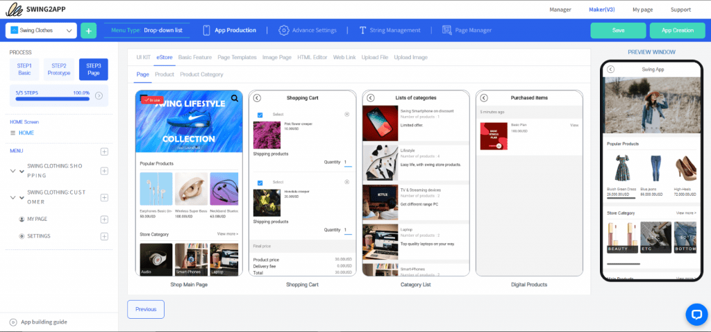
Here you can build your home screen and add other pages to your no-code app.
HOME SCREEN: Here you can edit the menu name and page design.
The various page designs provided are UI Kit, E-store, Basic features, Page templates, Image Page, HTML Editor, Weblink, Upload file, and Upload image.
Now, let’s discuss in detail how to edit your home page on Swing2App no-code app builder platform
HOW TO CREATE HOME SCREEN OF YOUR APP USING SWING2APP NO-CODE APP BUILDER
1) QUICK APP CREATION
Once you have followed all the steps mentioned above, you can now create home screen of your app.
For example, if you want to build a shopping/ e-commerce app all you need to do it to choose “eStore” page design and then choose “Shop main page” as your home screen page.
With this page you get sliding images on the top of home screen to capture the attention of your app users and induce them to buy those products.
Guide to shopping mall Main Page Slide Image.
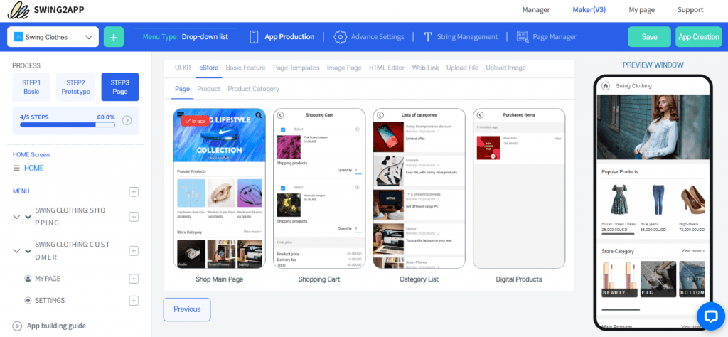
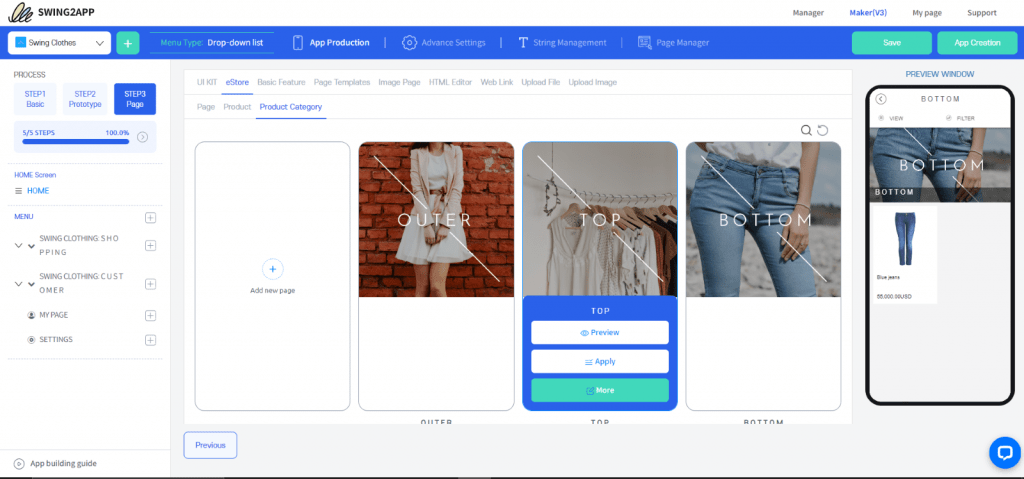
You can add new product category or even an individual product according to your business.
For example, if you want to add a new product category then go to “Product category” page design and click on the “+ Add new page”
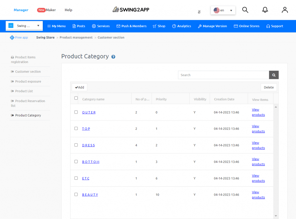
You will be redirected to Product category page, where you can easily add or delete product categories.
Similarly, you can also add or delete individual products registered under various product categories.
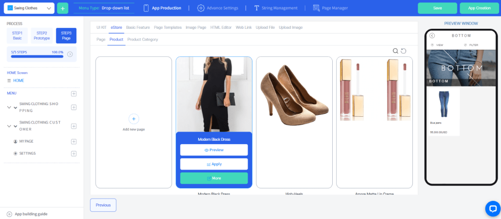
Guide for Product Category Registration and Physical Product registration.
2) APP FROM SCRATCH
When you choose to create your app from scratch that doesn’t mean you will have to code it. With Swing2App you can build no-code apps from scratch without any coding at all! This gives you more freedom to customize your app as per your business needs.
Here you will have to choose and each and every aspect of your app, there wouldn’t be anything pre-built. You will have access to all the template, but you will need to edit those choose the color palette add menu pages, etc.
To add the home screen, go to “Page template” in the page design and the click on “+ Add new page”.
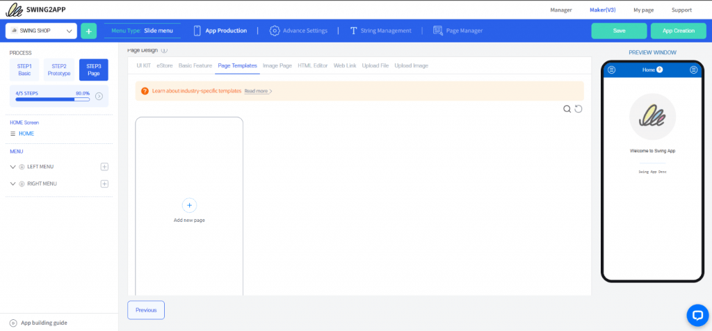
A new window will open where you can select industry-specific pre-built templates and edit them without any coding. On this new window click on “+” and following pop-up will display where you can select the page type as per your business industry.
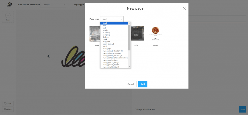
It’s up to you if you want to choose some different industry’s template for your business if it suits you better. For example, here we will choose nail to build a clothing store’s main page.
Everything highlighted in blue can be edited without any coding at all!
You can add or remove the buttons, rename them, change the colors, etc.
The best part is here you can also add link to your menu options (you can ink web page, feature, file, image, template, etc.)
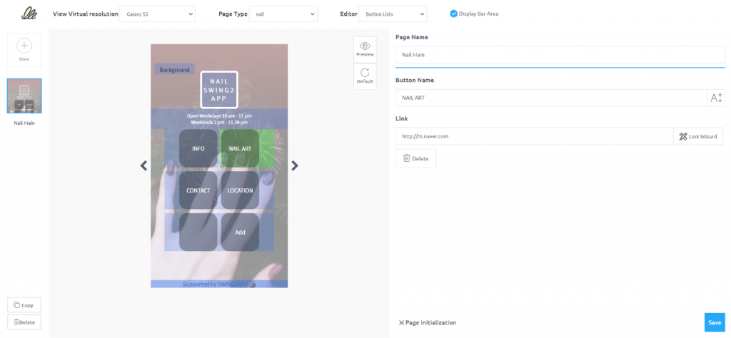
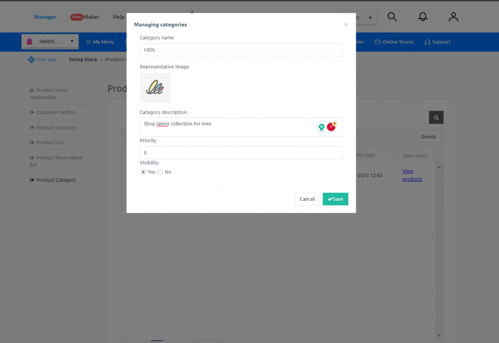
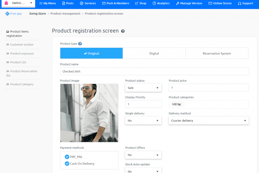
For example, in your clothing app you if want to add a product category named men and want to link it with your menu option. Then choose the menu option rename it to “Men” and click on the “Link wizard”, a pop-up will open where you can click on “+ add new page to add new product category”.
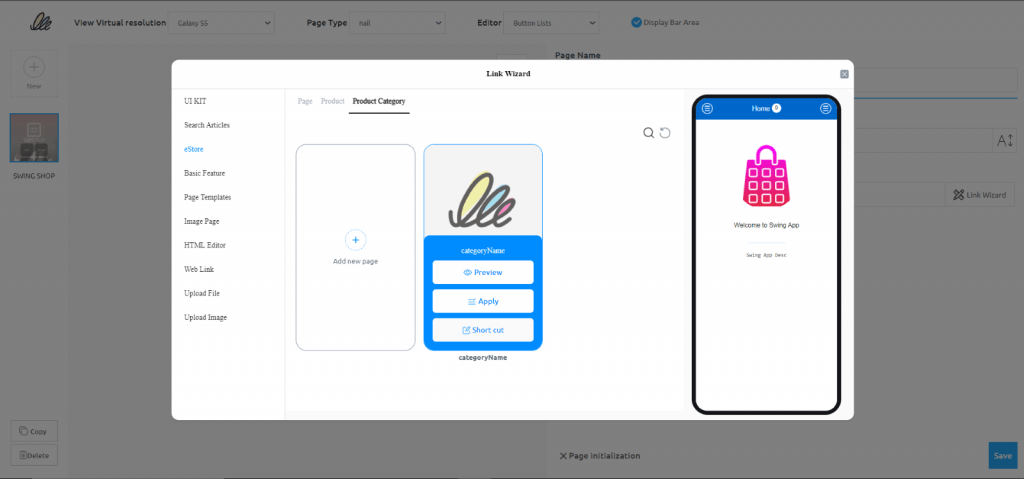
You will be taken to the “Manager” page where you can easily register a new product category, as shown below.
Finally, to apply this template to your home screen go back to the “Maker V3” window and in the “Page templates” refresh it, your newly created template will be reflected here, and you can apply it as the home screen of your app. Don’t forget to save you progress!
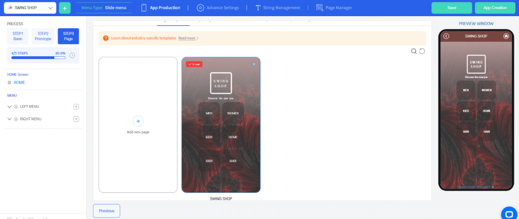
In the “preview window” you can see your app in real-time, and it would look something like this:
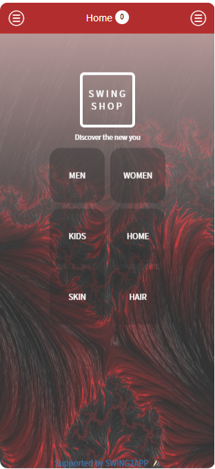
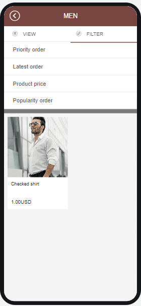
With your creativity you can do much more using the easily editable Swing2App templates.
3)IMAGE PAGE FOR HOME SCREEN
Here you can upload your own home screen design probably on Adobe XD / Photoshop (being the best tools) and then assign function to various images, icons, or buttons whatever you have used in your app home screen design.
To add an image as your app’s home screen, choose “Image page” in the page design and you will be redirected to this new window:
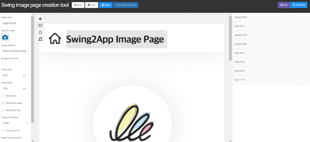
Click on the camera icon to add a new image.
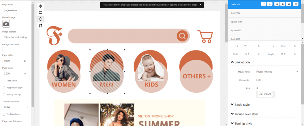
Once your image is uploaded, you must create an overlay of shapes over the images/ icons/ buttons where you want to link a page or feature, like I’ve done above for the men option. Don’t worry this won’t be displayed to the users, it is just to mark an area where if a user clicks some action will take place. To make your work organized, mane your clickable area shapes, for example here you can name it “Men”.
Then to add an action, click on “Link wizard” (on the right-hand side of screen) as done previously.
Similarly, add the product categories and save your Image page.
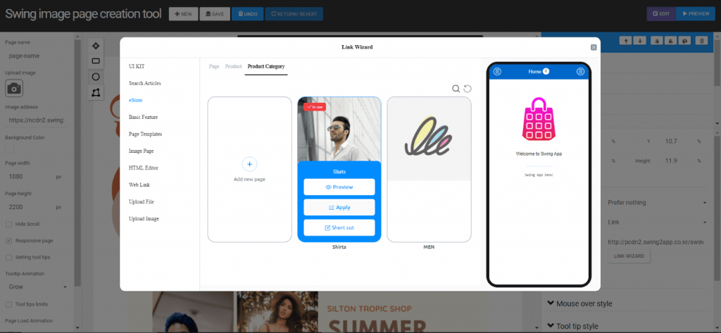
Finally, to apply this image page to your home screen go back to the “Maker V3” window and in the “Image page” refresh it, your newly created image page will be reflected here, and you can apply it as the home screen of your app. Don’t forget to save you progress!
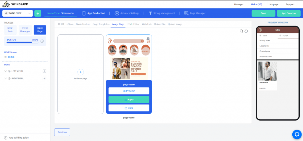
In the “preview window” you can see your app in real-time, and it would look something like this:
In the “preview window” you can see your app in real-time, and it would look something like this:
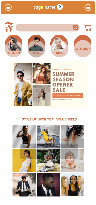
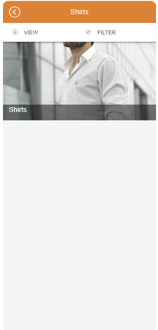
Guide for creating Image page on Swing2App no-code app builder.
If you want even more customization, you can code your home screen (if you know coding) using the HTML Editor in the page design option.
To sum up you can create home screen for your app in 4 different ways using Swing2App no-code app builder. The choice depends upon your business needs and app complexity as well.
HOME SCREEN DESIGN BEST PRACTICES
Below are our top best practices that deliver successful apps:
Keep it short:
Your app’s home screen should not be longer than 2 – 3 pages as most users don’t scroll further.
Highlight promotions or actions:
Use the slideshow on the top of your home screen or button rows for promotions or call to action.
Optimize the user experience:
Apart from product catalogs, you have the option to design buttons for a range of functions, including blogs, newsletters, contact information, shopping assistance, and more. If you have a loyalty program, you can even incorporate a link within the app that provides an explanation of how the program operates. Without loyalty program integration, users can collect points in the app but won’t be able to redeem them.
Strengthen your brand:
Boost your brand presence by adding a footer with social media icons and trademarks. It’s convenient for app users to access your Facebook or Instagram fan page directly from the app.
Simplify the side menu:
To avoid overwhelming users your menu list must be simple. Group informational pages under sub-homepages for a cleaner and more organized navigation experience.
EXAMPLE OF GOOD HOME SCREEN
DUOLINGO
– unique and engaging HOME SCREEN
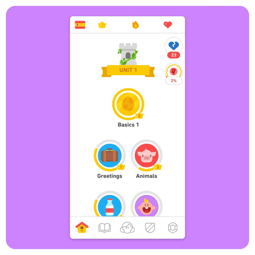
Surely, everyone who loves learning languages knows about Duolingo. I discovered this app on my own two years ago when I was learning. Each aspect of the app appears like a work of art, and when they blend, it creates an enchanting experience. This redesign ignited my motivation to rekindle my German language skills, something I hadn’t actively pursued in quite some time. I must give all the credit to that amazing redesign!
Duolingo does something else cool too. On the home screen page, they have a “visual adventure” or a game, you could say. I can see all the steps of this adventure, and it challenges me to improve my skills and “level up.” The home screen page makes learning a language (which can be pretty abstract) feel easier because I can see my progress. Not every app can do this, but making the home screen page interactive like this can really get users involved and motivated.
IN CONCLUSION
A good home screen can make your app more attractive to users and boost its chances of doing well. Swing2App no-code app builder makes it super easy to customize your home screen looks whether you’re making an online store app or something else.
The best part is you don’t have to be an expert in designing apps to create a great home screen with Swing2App no-code app builder. The Swing2App UI is easy to use and doesn’t require any coding at all!
So, if you want to learn more about creating a perfect home screen for your no-code app, check out Swing2App no-code app builder. Your app’s journey to success begins with a home screen that people love!
